First Look at the British Library Exhibition Space
To be honest, when we think of a Harry Potter exhibition, we imagine something rather magical and special. Today, Pottermore gave us a first look at what to expect from the upcoming British Library exhibition, and it’s safe to say that it looks like it will deliver on the magic.
The exhibition space is not the Hogwarts library but is reminiscent of a quirky, old magical library, with different Hogwarts subjects having their own dedicated room for visitors to explore.
The space has been designed by a company called Easy Tiger, and the director, Bren Lardner, spoke some more about the decisions behind their designs for the exhibition spaces.
I think putting on an exhibition is something like [a play] because you’re stirring up people’s emotions. You want people to forget the world outside and get involved with the objects.
We were creating a link between the British Library, Harry Potter and magic. We haven’t designed it to mirror the books or the films – it’s very much a magic library. Every visitor might think, ‘It’s a secret library here at the British Library; it’s always here, down this secret staircase!’ Or they might think, ‘This is a wonderful magic library!’ There are two collections coming together, so making sure that there was an independent forum for them was quite important.
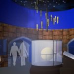
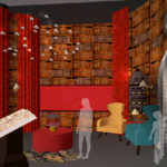
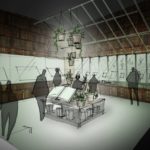
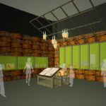
You can see some concept and final designs below.
Interestingly, most of the designs stayed pretty much the same, including herbology.
Herbology is one of the spaces that’s changed very little from the concept. I would say a lot of them have been refined, but we haven’t really had any big changes since the concept stage.
What we’ve done in Herbology is use a wooden greenhouse structure to give it that sense of plants and growing. In the centre of each exhibit there’s a core feature: in Herbology it’s pot plants and Wellington boots, that sort of thing; it just gives it that green twist.
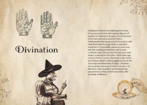
As well as designing the rooms, Easy Tiger also created information boards for the spaces.
The story panels are beautiful. They were originally loaded up with three-dimensional objects, but we instead just took things from the British Library’s collection that fit within that narrative. All of them will have an object fixed down to them – we wanted them to feel like real books that are being used.
You can read more about the design for the exhibition here. Details about the exhibition itself, which opens on October 20, as well as how to get tickets, are available here.
Have you got your tickets already?

