Review: “Fantastic Beasts” Exhibit at Warner Bros. Studio Tour
MuggleNet’s review of the Fantastic Beasts exhibit at the Warner Bros. Studio Tour in Hollywood, opening December 9, 2016. This is an honest review.
————-
My, oh my, Warner Bros., you hosted quite the party. First off, I’d like to say that I’m incredibly thankful for getting this opportunity. I’ve always wanted to go to the Warner Bros. Studio and take a tour there, so I felt like Jacob when Queenie made strudel for him. Now let’s dig in!
A beautiful building and a beautiful set-up inside. The caterers were dressed in ’20s fashion, the food displays appeared fake (too perfect, mind you), and vintage objects were placed about the room. Once it was time for the opening speech, they kept us all in the middle near the podium for when the main guests arrived – Dan Fogler and Bonnie Wright, who respectively play Jacob Kowalski and Ginny Weasley.
Unfortunately, they ran a bit behind schedule. After a delay no one expected, Dan came out and made his speech, followed by Bonnie.
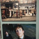
Around the bend and up the stairs, we were met with the full-sized poster of Harry and Newt exchanging ways, and I felt chills. It wasn’t until I turned the corner that my eyes caught on and tears formed. Yup, I was face to face with the Harry Potter exhibit. I would’ve cried right then and there, but I was overwhelmed, taking in the layout.
It surprised me as I originally thought that the Fantastic Beasts one would be in a different section, or even slightly apart from its predecessor. Turns out, they split the room in half – the left side with Harry Potter and the right with Fantastic Beasts.
Now, I could talk for miles about the left side, but that’s not why I made the trek in the first place.
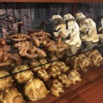
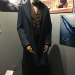
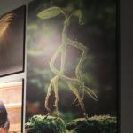
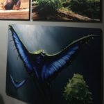
As I turned the corner at the top of the stairs and away from the Harry Potter side, I was greeted by Newt’s costume, along with his majestic beasts concept art in the background, then a TV on the wall (playing the different trailers in a loop), and then in the corner nearest me, I saw the display for “Kowalski’s Bakery Pastries.” They weren’t edible, but they appeared exquisite.
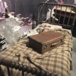
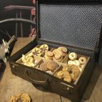
To the left of that, I found a wall dedicated to our favorite No-Maj, Mr. Jacob Kowalski himself. His costume is first, along with his bed, and Newt’s suitcase (closed, of course, since we wouldn’t want any more of the beasts coming out!), followed by a nightstand with Jacob’s suitcase open, showing off his beautiful pastry collection he had when he made his fateful journey to the bank.
However, the background art for the wall was my favorite piece of this display since it was the broken brick wall concept art. At last, on the wall separating this display from the next was more concept art of Kowalski’s Bakery and his apartment.
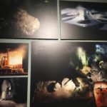
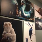
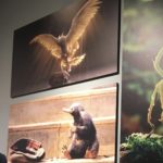
On the opposing side of this section, we have Newt’s corner, where you can see the mundane items he keeps in his case, as well as more art of his fantastic beasts. Further down, we have the Goldsteins’ wall. Located on the right side, in a small corner, are the sisters’ costumes. Interestingly, it wasn’t their normal costumes for the movie, but rather their speakeasy dresses.
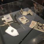
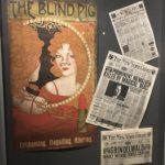
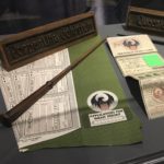
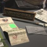
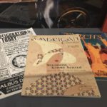
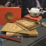
Then there are their display cases containing both wands, the tea kettle Tina used to capture the Occamy, books and magazines that could be found in their apartment, and name plaques, playing into Tina’s theme of work at MACUSA, along with her badge and paperwork. Next to that case were concept prints of their apartment. Following to the end of the wall were props used in Percival Graves’ office.
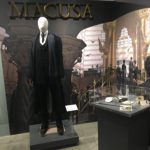
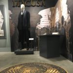
If you made a 180, you’ve found Graves’ costume and the scene at MACUSA. In his display case was his wand, the symbol of Grindelwald, his badge and folder, and the “Witches Live Among Us” leaflet.
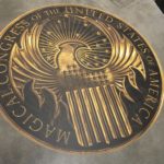
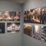
The concept art covering the wall was of MACUSA on a busy day. And on the floor, in front of his display, was the MACUSA symbol. I appreciated the touch they made to it since it was placed almost as though it was leading you to the next display.
Well, not a display – more like a corner dedicated to the initial boarding scene that Newt goes through as he’s welcomed into North America. In front of the concept art, they placed luggage, stacked on top of one another, a simple corner to gaze upon that I loved as a transition, as the walkway zigzagged to another set of concept art lining the wall.
I’d like to point out that concept art is something I highly treasure, so seeing these prints up close left me breathless. This wall seemed to be dedicated to the city itself, with only one print of Seraphina and the rest of New York.
The walkway ended here, opening up into the Great Hall area. Immediately in front was a display named “Gryffindor” that had a Quidditch model up, with extra “toys” laying around it. My best guess is that they would’ve been used by the fans in the crowd during the intense matches. Just ahead of that was the stool where the famous Sorting Hat sat, waiting to judge the next head it was placed on.
Ahead of this was the Great Hall wall, which displayed the costumes for Professors Dumbledore, Flitwick, Hagrid, McGonagall, and Snape. When I spoke to one of the tour guides, she told me that this exhibit hadn’t had Hagrid’s costume here before, so his inclusion was more recent than the other costumes.
I noticed they had a display case with a fancy printing of Fantastic Beasts and Where to Find Them, which mounted itself below the title of the exhibit itself. I realized this design enabled them to create a circular walk-through, starting with the Harry Potter side and ending with the way I came in. Ingenious of them, I think.
Overall, the Fantastic Beasts exhibit was, well, fantastic! I loved the open layout and the way they connected the walk-through via the characters connections. I thought that being able to see the costumes in real life would’ve been the highlight of this tour. Instead, it was everything surrounding them that made the experience worthwhile. The amount of detail they put into this was enough to make any fan satisfied.
All costumes for the Fantastic Beasts characters were designed by Colleen Atwood, while the ones for the Hogwarts professors were designed by Jany Temime. The exhibit opens December 9, 2016, so buy your tickets here!
- Jacob Kowalski’s Bakery
- Kowalski’s Bed + Newt’s case
- Jacob’s pastry suitcase
- Percival Graves at MACUSA
- MACUSA symbol from “Fantastic Beasts”
- Percival Graves display
- Percival Graves MACUSA display
- Concept 1 – NYC
- Percival Graves office props
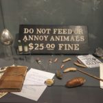
- Blind Pig display
- Goldstein apartment
- Porpentina Goldstein case
- Queenie Goldstein display
- Goldstein display
- Goldstein display
- Kowalski concept art
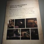
- Newt Scamander suitcase description
- Newt Scamander suitcase display
- Habitats
- Occamy, Demiguise, Billywig, and Erumpent
- Thunderbird and Niffler
- Pickett the Bowtruckle
- Swooping Evil

