“A Sense of the Artist”: Illustrators Discuss 20 Years of “Harry Potter” at San Diego Comic-Con
Before any reader opens a Harry Potter book, more likely than not they are enticed into the story by the cover art. Depending on which copy that reader is exploring, the pages within might also include illustrations. At San Diego Comic-Con this weekend, those tremendous artists, along with the editor and art director of the series, discussed how in the 20 years since the series was published in the United States the art of Harry Potter has drawn readers into the magical world.
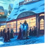
First to discuss his process was Kazu Kibuishi, of the 15th-anniversary paperback editions. Kibuishi revealed that when he was first asked to illustrate these special editions, he was recovering from bacterial meningitis and had even been in a coma. He called designing and drawing the covers his “therapy.” Using only digital tools, he began what would become hundreds of iterations for each cover. The leading sketch influencing all of the final outcomes, however, was the sketch for Harry Potter and the Prisoner of Azkaban. The scene where Harry casts a Patronus to fight off the Dementors around the lake was the scene Kibuishi knew he wanted to do right away: “There was no other scene I could imagine painting,” he said. Kibuishi also revealed some Easter eggs in the box set cover, a scene of snowy Hogsmeade. He himself, as well as art director David Saylor, are depicted working in Zonko’s, while J.K. Rowling writes the books above the shop. Arthur A. Levine (the American editor) and his assistant, Cheryl Klein, are seen in a bookshop. Kibuishi’s wife, as well as his assistant, Jason, are seen walking down the street.
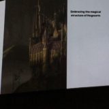
Next, Jim Kay, who has done fully illustrated versions of the first three books and is working on the next four, discussed his process. After showing some models he made of different locations and characters, he described how each model helped him in developing lighting and design. After a collective “aww” from the audience over his small model of Dobby, Kay admitted he did not like the house-elf at first but grew to love him while drawing the character. Kay also discussed how anxious he is about each of his drawings and how about 90% of what he creates “goes in the bin” until it’s just right – or he runs out of time!
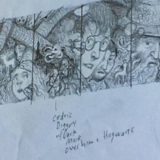
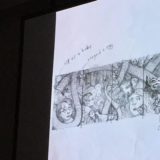
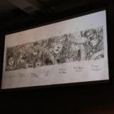
The final artist to speak was Brian Selznick. For his 20th-anniversary covers, Selznick said he had an idea that all seven covers, when lined up, should show a reader one cohesive visual of the journey the story would take. At the far left end, with Harry Potter and the Sorcerer’s Stone, he began by depicting Harry’s birth, and he packed each cover full of moments in the story, all the way until 19 years later and the epilogue. To tie them all together, he started by making swooping lines that turned into a snake. That snake “represents evil,” and when the head of the snake is seen for the first time on the cover of Harry Potter and the Deathly Hallows, it is vanquished. Selznick listened to the audiobooks narrated by Jim Dale while drawing, and in a wonderful coincidence of timing, he arrived at the Battle of Hogwarts just as he was drawing the final duel between Harry and Voldemort. And to the delight of all listening, Selznick revealed that many of the characters and objects on the covers are based on things and people in his life – including Dolores Umbridge, who was based on Selznick’s husband!
Editor Arthur A. Levine and art director David Saylor praised all four artists, including original artist Mary GrandPré, for the common humanity and different styles in each iteration of the covers. They said that from the beginning, they wanted the book to “feel like a rare, beautiful, magical object,” and they put a lot of unusual care into the design of the book, from the matte paper to the gold foil. Credit for the typography that is now so famous is given to Mary GrandPré, who asked to try hand-lettering the text. An iconic logo was born!
The new 20th-anniversary books are now available separately, and a special box set beautifully designed by Selznick will be available in August.


