Brian Selznick Discusses the Challenges of Illustrating the New US 20th-Anniversary Covers!
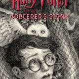
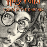
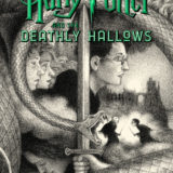
As part of the celebrations of the 20th anniversary since the release of Harry Potter and the Sorcerer’s Stone in the United States, celebrated illustrator Brian Selznick has designed brand-new covers for all seven books!
However, the covers not only fit each of the individual books, but they also merge together to create one mural, making it the perfect addition to your bookshelf! Fans will be able to spot Nagini curving between each cover, connecting them into a striking image that encapsulates the battle between good and evil.
Selznick is not just a seasoned illustrator, and winner of the Caldecott Medal for his work on The Invention of Hugo Cabret, but also a true Harry Potter fan! Selznick may only have read the books in 2015., but he immediately fell in love and has since declared himself a proud Hufflepuff!
Selznick has always respected the Potter phenomenon but after he received the call to design the new covers, he was all too aware of fan expectations. Thankfully, this only increased Selznick’s desire to create something magical for the fans.
I’d be lying if I said I never worried about living up to the expectations of the fans, but then I remembered I was a fan too, and I was drawing something I loved and believed in, so it got easier from there.
Illustrating the covers may have been a labor of love but his ambitious plans didn’t make it an easy task. Selznick knew from the start that he wanted to create covers that would join together to create one image, but he only had two weeks to complete his initial sketches!
Challenges included figuring out how to draw the figures on the final cover so I could sum up the series without giving anything away for readers who will be new to the books. Also, it’s really hard drawing Harry’s round glasses in different perspectives (seeing them from different angles) so that they look round and not like weird ovals. It was also hard to draw the labyrinth for the Triwizard Cup, and figuring out how many buttons might be on the cloaks.
The Harry Potter covers have received the makeover treatment before, but Selznick was careful to ensure that he wasn’t influenced by Kazu Kibuishi’s 15th-anniversary covers or Mary GrandPré’s original work.
I tried very hard to put aside all previous Harry Potter representations and focus only on what J.K. Rowling wrote… my goal was to find what I wanted everything to look like myself.
Selznick has led an illustrious career, but his work on Harry Potter stands out as an extraordinary experience. Selznick is delighted to be able to contribute to the Potter universe and interact with the fans.
Well, everything about Harry Potter is unique. There’s never been anything quite like this phenomenon, and it’s such an honor to play a small part in its ongoing evolution. One particularly exciting moment was when I was invited to speak at the Harry Potter [c]elebration [at t]he Wizarding World of Harry Potter at Universal [Orlando Resort], where I addressed a crowd of five thousand people who all cheered like mad when I said I was a Hufflepuff.
Overall, Selznick hopes that fans see the passion he has for the series reflected in his work and take home the message that hope is always to be found.
I tried to get across my love for the books, and I tried to highlight the themes that were most important to me: the importance of friendship, and the battle between good and evil. Now more than ever we need to be reminded that evil can be vanquished.
Take a look at the covers below and be sure to check out the mural they create!
Want to see these books adorn your bookshelf? They’re available to buy now! Are these your favorite covers yet or are the originals unbeatable?

