- By MuggleNet Editorial Staff
- 14 Apr, 2026
- Editor’s Pick
When MuggleNet set out to refresh its look for a new era, we knew we needed someone who could honor over two decades of fandom while bringing something fresh and modern to the table. We found that person in Alexandria Vernon, a UK-based designer whose portfolio was impressive. You may not know her name, but you almost certainly know her work: she created the distinctive lettering for Wonka (2023), and her design credits include British institutions as storied as Shakespeare’s Globe.
When we approached Alexandria about reimagining the MuggleNet identity, she immediately understood what this site has meant to millions of fans since 1999.
We caught up with Alexandria to talk about her design process, what it’s like working on a brand with such a passionate fanbase, how she approached the MuggleNet brief, and what she thinks makes a great logo endure.

What was your first impression of MuggleNet as a brand, and what felt most important to capture in the new logo?
AV: My first thoughts were that it’s amazing that the longest running Harry Potter fansite is still going! MuggleNet has legacy and is the unofficial home of the Wizarding World. But the previous branding wasn’t reflecting that, it was feeling dated and lacked some of that magic.
How did you approach balancing nostalgia for longtime fans with a look that feels fresh and modern?
AV: Nostalgia is created with the familiar, and we needed to bring that familiar essence back into the new branding – the classics tropes of magic, whimsy and fantasy that Harry Potter is synonymous with. I took reference from some magical packaging and props to bring the design back to the core of the visual language of Harry Potter whilst making it feel modern and unique.
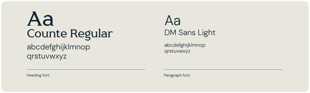
I carefully choose fonts that captured a sense of nostalgia, yet were modern adaptations. For instance, the logo uses a mix of Blackletter or Slab Serif typefaces, yet with a custom modern twist.
What were the biggest creative challenges in designing a logo for a fan brand with such a long history?
AV: Creating something that is exciting now but will stand the test of times in many years to come. I hope that the logo does that, and adds on the the existing legacy of MuggleNet.
How did you want the logo to feel emotionally when someone sees it for the first time?
AV: I wanted people to feel reminded of the world they were in when they read the Harry Potter books or watched the films for the first time.
Are there any details in the final design that fans might not notice right away, but that were very intentional?
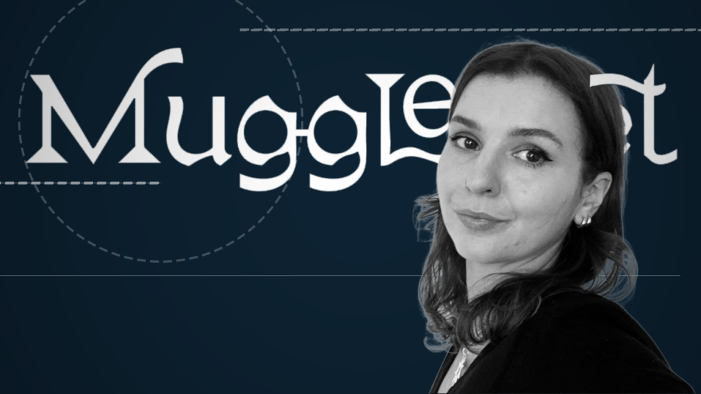
AV: Yes! Maybe you noticed it, but the bowels of the two ‘g’s in ‘Muggle’ replicate Harry Potter’s iconic round glasses. In part of the development there was actually a little lightening bolt scar above it – but it was removed as it was almost too on the nose. I think it was a good decision.
Now that the logo is out in the world, what are you most proud of in the final design?
AV: I think it really captures the essence of the Wizarding World, it feels eclectic, like the community it serves – and I really loved working with the MuggleNet team on the project!